
Best online tools for creating infographics and charts
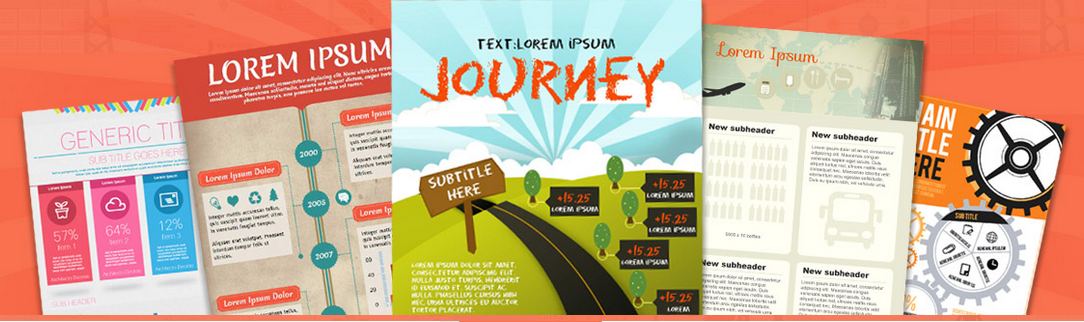
Now everything is said using infographics. Because it is easier, faster, and more engaging. Sooner or later you too will find a need to create an image “that says things.” Infographics are simply using graphic design to visualize the content that has long existed in other forms. While it is not useful for all types of content, infographics can add valuable context to existing stories by using visuals to show relationships in data, anatomy, hierarchy, chronology, and geography.It also makes it easier for the general public to understand complex things. Here are some online tools which will help you create infographics and charts quickly and for free. It never fails.
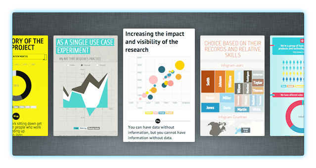
Visual.ly
This infographic about why you need infographics was made in visual.ly 😀

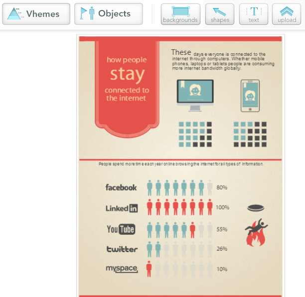
Piktochart
Piktochart is difficult to compete. The free version includes only a handful of the hundreds of templates that are available to subscribers, but even these are beautiful and customizable to the last detail. The editing tools include graphics, shapes, texts, and images. You can save your work to your online portfolio to continue at another time, or export it as JPG or PNG image.
Easel.ly
In Easel.Ly, you can manipulate any element on the screen as in Piktochart. The only saving options is to export to JPG, but Easel.ly has more facilities to share your graphics on websites and social networks, so it is very useful to quickly spread your creations.(If you are lazy to download and then share)
Venngage
If you are looking for an easy tool to make your infographics then venngage is the best. You can choose from hundreds of templates, charts,icons and themes. Also, you can upload your own images and backgrounds, or customize the theme to suit your brand. The coolest thing is that you can animate them too!
Infogr.am
Infogr.am is one of the latest tools for creating online informational graphics. It is more oriented to traditional statistical infographics, but with great visual power. Note that it is not as configurable as what we’ve seen so far, but if you’re looking to put all those data you have in text files or XLS into a beautiful graph, Infogr.am is the # 1 choice.
Hohli
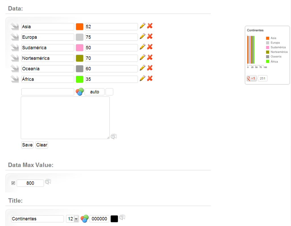
There is possibly no simple way to create statistical graphics than by using this tool. There are 14 different models to choose the charts (bar, pie, Venn diagrams, lines, etc..) where you must simply enter the reference data using the form. If infographics may be very large or complicated because the data can be imported. The images are saved as PNG and can be shared online.
Dipity
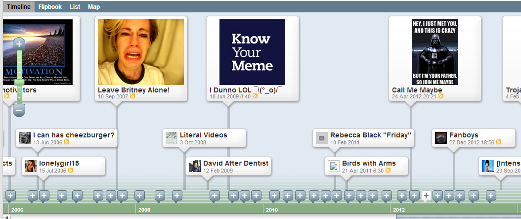
Dipity is a tool to make interactive timelines. You will not have to touch anything directly, just simply fill in the forms with the necessary information, and Dipity will create it for you. The timelines support videos and pictures.You can keep it private, or selectively share time.
iCharts
iCharts is another tool for statistical graphics, similar to Hohli, but with a crucial difference: it allows data import. In comparison, it is simple and is much heavier to work. For basic graphics, it includes several nice templates that will make your graphics look well enough. You can download the work to PNG, PDF, send it to a website, share it with users and social networks.
Gliffy
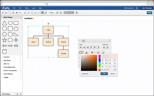
Gliffy is an interesting service for computer graphics, a specialist in connective networks, organizational charts, and for other graphics. It Includes some alternatives that we have not seen so far, more specifically in the areas of technology, such as networking. It has several export options (image, XML).
Tagxedo

Tagxedo is a creative way to integrate words into a graph. you enter a data source (which can be a website, a Twitter account, search, etc..) and generate a huge image with the most relevant words around that criterion. Some are truly unreadable mess, but some of them are really good too. If you prefer to do the work manually, it also includes an editor from which you can start everything from scratch. There are several quality options and recorded formats.
Visualize
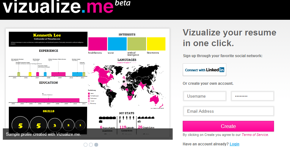
It is a infographic resume generator. You can visualize your resume in one click and also take a look at previous examples. We think that this is how our resumes are going to look like in the future.
We hope that you found this list useful. If you have any better info-graphic tool to add to this list, then please comment below and let us know.
